Color Psychology in Café Chairs: How Colors Influence the Dining Experience
Step into a café, and what is the first thing you notice? The smell of freshly ground coffee? The gentle buzz of conversations? Or maybe, without even knowing it, the colors that surround you — most especially those of the chairs that you occupy.
Color psychology — the psychology of how colors affect mood and behavior — plays a very influential role in the way our perception of space. In coffee shops, where atmosphere is paramount, chair color isn't merely about fashion or trend. It's an unspoken messenger that directs the mood, regulates appetite, and even determines how long a consumer will linger.
Let's sit down (in your choice of color!) and find out the ways café seating employs color to create the ultimate atmosphere.
Red: The Appetite Enhancer

The color of choice for stimulating excitement is red. Red is used in the logos and dining rooms of many fast-food restaurants, which is not surprising. Best suited for high-turnover locations where table turnover is crucial, red chairs in café seating can create a fast pace. It is perfect for vibrant café chains or lively coffee shops since it subtly increases heart rate & draws attention.
But red is a very strong color, so best used sparingly. Red chairs with white or gray walls or tables can avoid making the place feel overwhelming.
Yellow and Orange: The Social Sparkers

Yellow and orange are bright and cheery colors that evoke feelings of coziness, creativity, and friendliness. Orange and yellow chairs may make a café feel lively and welcoming. They are perfect for cafés that are frequented by groups of friends, students, or coworkers because they are known to increase communication and excite cerebral processes.
Yellow, especially, can add a playful spirit, perfect for bakeries or breakfast restaurants. Too much yellow, though, leads to visual fatigue — keep it balanced. Consider mustard-hued cushions or Pale orange plastic chairs with wood trim create a modern but comfortable feel.
Blue: Peaceful and Cool

Blue café chairs evoke a sense of serenity and tranquillity, providing an important break from the chaos of the outside world. Light blues provide a fresh, spacious, relaxed atmosphere, and dark blues create a sophisticated, snuggly one.
Interestingly, blue further tends to decrease appetite mildly, so it is less usually seen in fast food restaurants or high-volume diners. Blue seats, on the other hand, could be perfect for a café that specializes in long sips, meaningful discussions, or reading nooks.
Green: The Natural Healer

Green represents balance and rebirth. Being used in café chairs, especially in combination with plants and natural décor, creates a feeling of healthiness and well-being. This is the reason why it's widely used in cafés that specialize in organic food, sustainability, or plant-based dishes.
Sage metal stools, olive fabric, or mint wooden chairs can make consumers feel grounded & comfortable — a gentle push to mindfulness & slow dining.
Brown and Earth Tones: Grounded and Cozy

Brown, taupe, and similar earthy tones introduce relaxation, comfort, and a natural ambiance. Brown chairs tend to fit good with wooden interiors and country-style design schemes, so they are perfect for cafés with a comfortable or vintage atmosphere.
Earth tones aren't only fashionable — they comfort people and calm them. Consider a café on a rainy day: the rich brown chair you sink into is like a hug. This color palette welcomes customers to stay awhile, So it's perfect for regions that encourage staying longer.
Black and Grey: Modern Minimalism

Black and grey chairs project modernity, sophistication, and elegance. They are the different feature of minimalist cafés and metropolitan coffee bars. Although the colors aren't especially appealing, they definitely underline the gravity or give the surroundings a "Grown-up" sense
Black armchairs with metal or concrete tables, but, can be sleek and stylish. Grey, by contrast, is perfect for softening the room's energy, creating a more neutral, balanced feel.
These colors are further perfect for allowing other design elements — like artwork, lighting, or presentation of food — to get all the attention.
White and Pastels: Light, Airy, and Instagrammable

White chairs and pastel seating are favorites of tastefully decorated cafés — particularly those made with Instagram users in mind. Pale pinks, baby blues, and creamy whites make rooms looks larger, cleaner, and brighter.
These colors are trending in youth-oriented cafés or people who are attracted to a peaceful, ethereal atmosphere. Combined with floral backgrounds or artistically designed table settings, pastel chairs provide a perfect venue for an intimate coffee photo shoot.
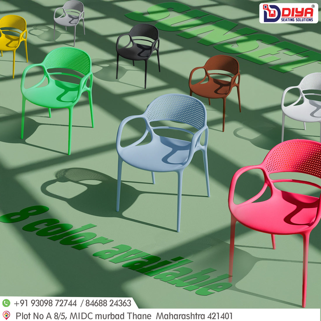
Mixing It Up: Multicolor and Eclectic Vibes
Others Throw the regulations out the window and go for a rainbow color design of seats — and it pays off! A variety of colors can introduce playfulness, creativity, and a free-spirited attitude. This is same right for artsy cafés, kids' areas, or facilitiess that aim to move away from tradition.
Vibrant seating further makes each experience distinct and stimulating. It communicates to clients: "This is not a place for you to merge in. It's where you create memories."