The Psychology of Café Seating Color and Its Effect on Sales
Colors in café design do so much more than just add color to your space—they're a powerful means of effects to buyers perception, mood, and even purchasing habits. The colors you select for seating at your café can have a subtle impact on the length of time customers stay, how much they spend, and the overall atmosphere of your space. Knowing the psychology behind color can assist café owners in establishing an environment that not only draws people in but further encourages sales.
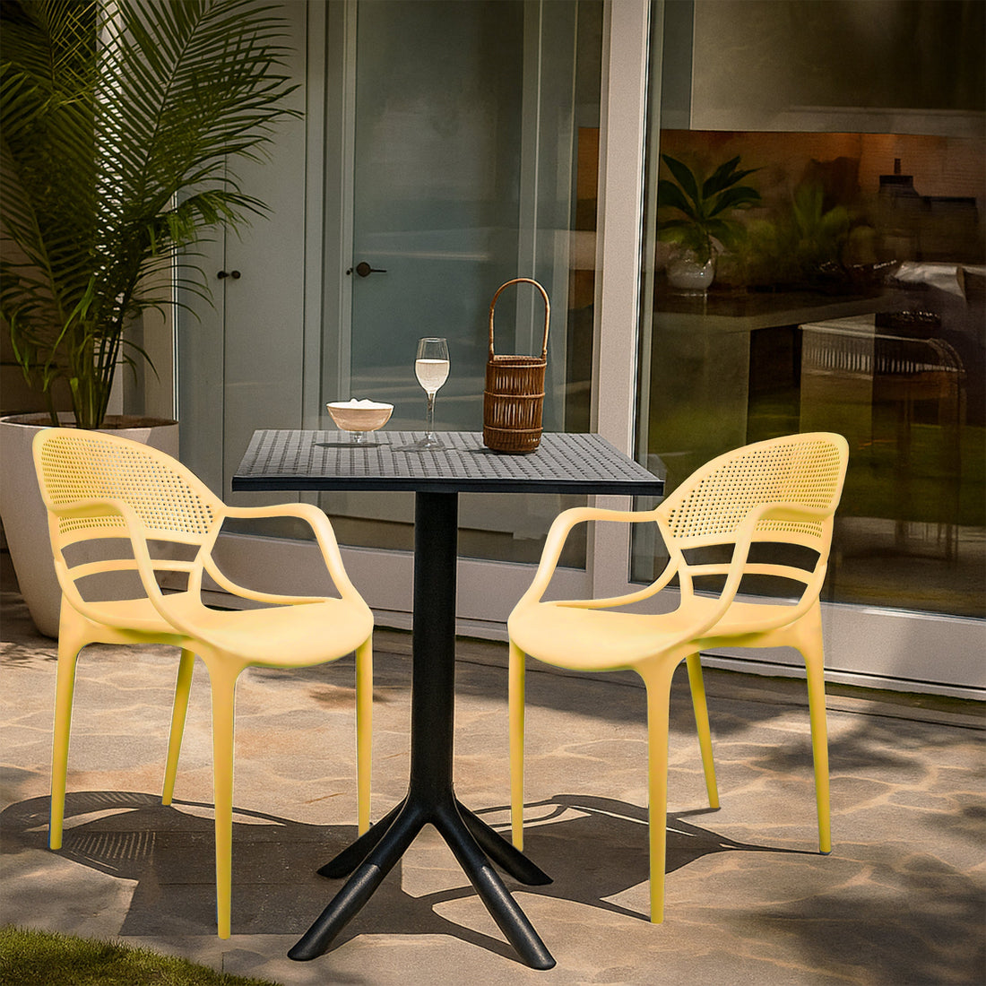
1. Warm Colors Stimulate Appetite and Energy
Red, orange, and yellow colors have been proven to stimulate the senses and generate a lively & dynamic environment.
Red: Pictured like passion and excitement, red is able to raise heart tract &gently stimulate appetite. Red is famously used by fast-food restaurants to stimulate rapid turnover & greater sales.
Orange and Yellow: These bright colors motivate heat and hospitality. They provide an comfy place that invites customers to order a second pastry or coffee.
Used in café seating—e.g., red or orange chair cushions or accent chairs—these colors may inspire buyers with more food orders and enjoy the lively atmosphere.

2. Cool Colors Encourage Relaxation and Longer Stays
Blues & greens exert a calming, relaxing influence.
Blue: Famous for its calming nature, blue seats can make your café peaceful and encourage patrons to linger. Although blue is usually not considered an appetite stimulant, it is a good choice for those wanting to establish a calm, unhurried atmosphere—perfect for readers or telecommuters.
Green: Suggesting nature and freshness, green seating encourages a feeling of equilibrium & peace. It complements nicely with plant-filled interior spaces and can gently suggest healthy, organic meal selections.
Seating in cool colors can assist cafés in creating a casual ambiance where customers stay awhile, which enhances the ability to buy a few drinks along with or desserts.

3. Neutrals Offer Versatility and Refinement
White, beige, gray, and black seating makes for a timeless, variable theme.
Gray and Black: Provide contemporary sophistication and complement bold highlights right. Too much but black is off-putting unless offset with warm lighting.
Beige and White: Provide a feeling of cleanliness and spaciousness, making small spaces look larger. These colors are suitable for cafés that want a minimalist & Scandinavian style style.

Neutral seating allows For agility, you can quickly change the café's mood by altering décor or seasonal highlights.
4. Accent Colors Create Focal Points
Placing vibrant accent chairs or pillows of contrasting color brings attention to every bit like a comfortable reading nook or the prime Instagram-worthy spot. Not only does this improved the aesthetics but can direct customers towards specific seating areas, improved space efficiency.

5. Cultural and Brand Alignment
Color psychology isn’t one-size-fits-all. The cultural context of your target market matters. For example, red symbolizes luck & Festivity in some cultures but may show fear. in others. Ensure the color palette aligns with your brand identity—if you’re a stylish made café or a family-friendly coffee spot.
6. Balancing Mood and Function

While color can have an effect on emotions and purchases, peace is important. Overwhelming people with strong colors can be off-putting, and too much neutrality is boring. Combining warm and cool colors—or combining neutrals with pensive sighs of color—produces a soothing, welcoming atmosphere.